Project Overview
Veedol Dosti is a rewards and engagement platform consisting of a mobile app for end users
and a web-based coupon management dashboard for internal operations.
- The app enables users to earn points, scratch coupons, track rewards, and redeem offers,
while the dashboard allows teams to manage, review, and activate coupons efficiently.
- My role involved redesigning the Veedol Dosti mobile app UI/UX to improve usability,
visual clarity, and engagement, along with revamping the coupon management dashboard to
streamline workflows, enhance data readability, and simplify operational tasks.
- The project focused on creating a cohesive experience across both platforms while
aligning with Veedol’s brand identity and improving overall user efficiency.
Problem Statement
The existing experience across the app and dashboard felt cluttered and difficult to
navigate. In the mobile app, users struggled to quickly understand their points, wallet
balance, and available rewards due to poor visual hierarchy and inconsistent UI elements.
The interface relied heavily on dense layouts and outdated visual patterns, which increased
cognitive load and reduced engagement.
On the dashboard side, operational teams faced challenges managing coupons efficiently. The
data-heavy tables were hard to scan, coupon statuses were not clearly distinguishable, and
key actions such as reviewing or activating coupons required unnecessary effort. This
resulted in slower processing and higher chances of error.
Design Goals
The primary goal was to simplify both experiences without removing functionality. For the
app, the focus was on improving clarity, scannability, and overall user engagement.
For the dashboard, the goal was to streamline workflows, improve data readability, and
reduce the time required to process coupons.
A shared objective across both platforms was to create a consistent and scalable design
system that aligned with Veedol’s brand identity.
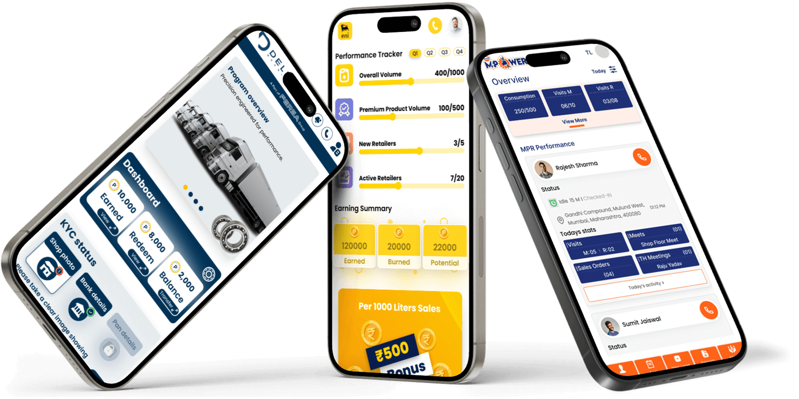
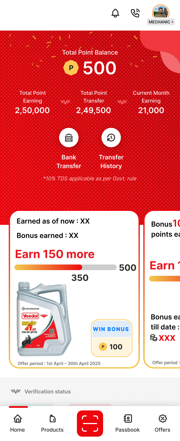
For the mobile app, the redesign began by restructuring the home screen around the most
important user information. Points, wallet balance, offers, and primary actions were given
clearer visual priority through improved spacing, typography hierarchy, and layout
structure.
Visual noise was reduced by standardizing cards, buttons, icons, and colors, allowing users
to understand the interface at a glance.
A shared objective across both platforms was to create a consistent and scalable design
system that aligned with Veedol’s brand identity.
Reward scratch and redemption flows were simplified to feel more intuitive and visually
engaging, guiding users step-by-step without confusion.
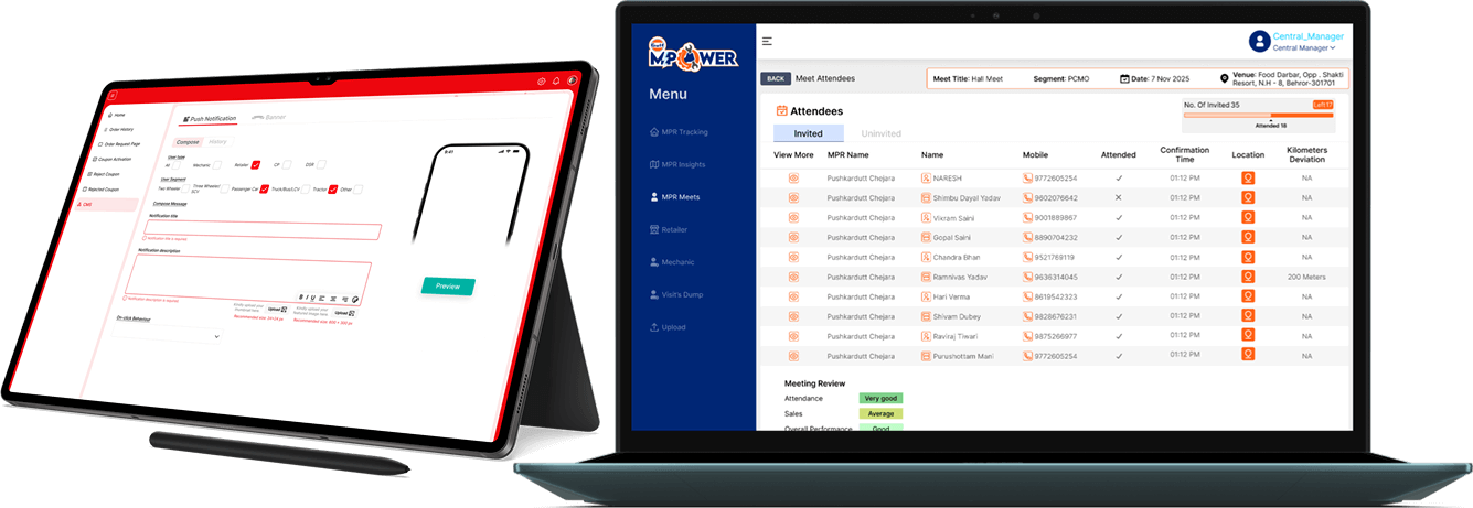
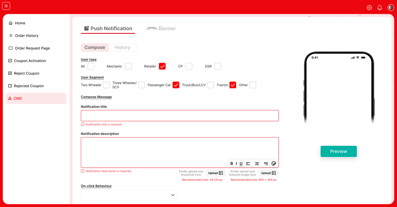
For the dashboard, the design approach centered on operational efficiency. The table layout
was redesigned using a structured grid to improve readability and scanning. Coupon statuses
were visually differentiated to allow faster decision-making, and actions such as review,
confirm, and activate were reorganized to follow a logical flow.
Filters, search, and date
selection were refined to help users quickly narrow down large data sets, while the sidebar
navigation was simplified to improve orientation within the system.
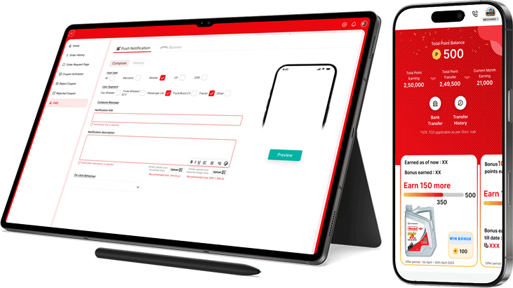
App & Dashboard Alignment
A key aspect of the project was ensuring that both platforms felt connected. Coupon states
shown in the app were designed to clearly reflect the statuses used in the dashboard,
reducing confusion between user-facing and internal systems. Shared visual patterns and
interaction logic helped create a cohesive experience across the product ecosystem.
Outcome
The redesigned experience improved clarity for end users and significantly reduced friction
for internal teams. Users were able to understand rewards and take action more easily, while
operational teams could process coupons faster with fewer errors. The updated design also
established a scalable foundation for future features across both the app and dashboard.
Key Learnings
- Clear visual hierarchy helps users understand information faster.
- Too much content on one screen increases confusion.
- Simple layouts improve speed and reduce mistakes.
- Consistent components make the product easier to use.
- Clear status indicators help users make quick decisions.
- Small spacing and alignment changes can greatly improve usability.
- Matching app and dashboard logic reduces user confusion.